


The Matrix Arena Website & Brand Refresh
Redesigning the website and promotional assets to improve clarity, bookings, and brand consistency — online and in print.
01. OVERVIEW
PROJECT OVERVIEW
The Matrix Arena is a multi-activity entertainment centre in the Isle of Man, offering VR, arcade games, racing sims, and more. While the business was growing, the existing website gave the impression that the venue was VR-only, and visitors often had no clear way to understand what was available or who it was for. I was brought in to refresh both the website and print assets to better reflect the full offering, help people explore activities by age group, promote group bookings, and reduce the number of questions staff had to answer manually. I redesigned the site in WordPress using Elementor, made it fully responsive, and updated the homepage structure to highlight activities by type and audience. Alongside this, I created a full set of branded assets — including gift vouchers, social graphics, icons, and posters — to align the in-person and digital experience.
03. GOALS

USER GOALS
Visitors needed a quicker way to understand what was available at The Matrix Arena based on age, interest, or group type. The site had to feel easy to navigate, responsive on mobile, and visually clear enough for first-time users to find the right activity and book with confidence.

BUSINESS GOALS
The Matrix team wanted to reduce the time spent answering common questions, increase bookings for parties and corporate events, and sell more gift cards. The site also needed to reflect the full range of offerings — not just VR — and align consistently with printed materials used in the venue and online.
03. DESIGN FOCUS
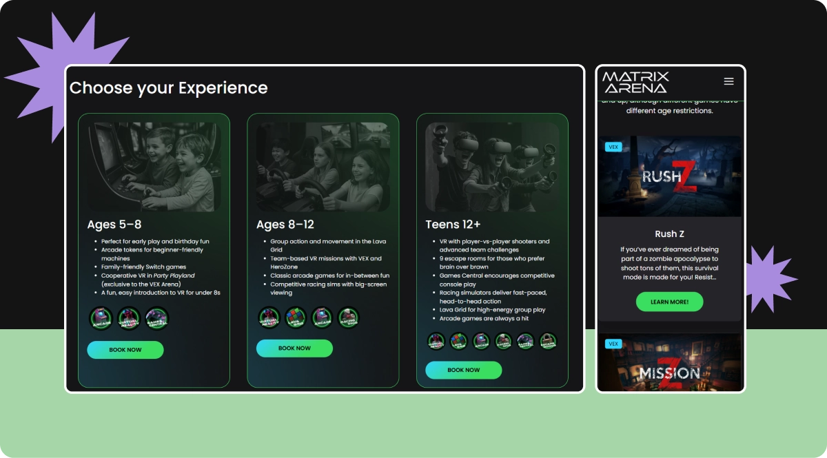
The redesign centred on clarity, accessibility, and alignment across platforms. On the website, this meant restructuring the homepage around age-based activity categories, making it easier for visitors to explore what's available for their group — whether they were booking for a 7-year-old or a corporate event.
Every element was designed to reduce friction. The updated layout improves scanability, with bold sections for activities, clear CTAs, and mobile-friendly structure built in Elementor. I also created a cohesive visual language across web and print, including custom icons, booking graphics, gift vouchers, social media assets, and in-store posters, ensuring the Matrix brand felt consistent and engaging at every touchpoint.
04. WEBSITE REDESIGN
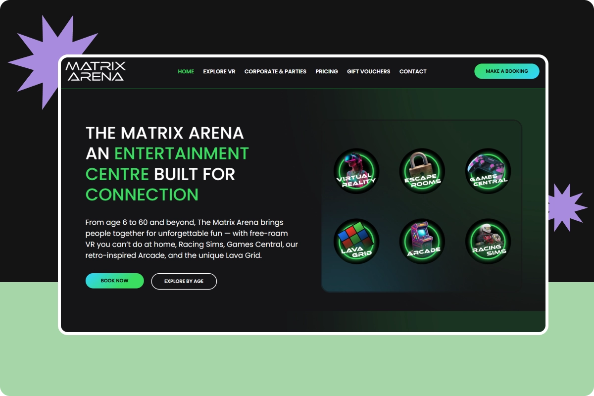
The updated Matrix Arena website focused on making the experience easier to navigate and more informative for every visitor. The homepage was completely restructured around age-based categories, helping parents, teens, and adult groups quickly understand which activities were right for them.
The navigation and menu structure were simplified to remove clutter and guide users toward key pages like bookings, gift cards, and experiences. I also introduced a clear pricing section with easy-to-read visuals that break down costs by activity type, reducing the need for staff to explain it manually.
The VR page was rebuilt to showcase games by category, using a modular layout of WordPress posts and pages. Each game is displayed with a cover image, title, and short description, making it easy to browse and compare. Every section includes clear CTAs for booking or learning more.
To add more personality and social proof, I embedded videos from local media outlets directly into the homepage — giving new visitors a quick sense of what to expect and helping build trust from the start.
05. ICON & BANNER DESIGN
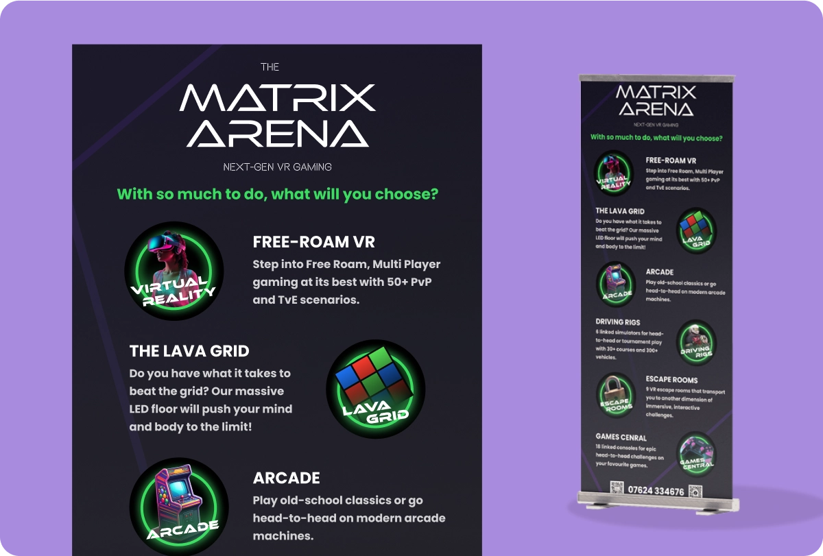
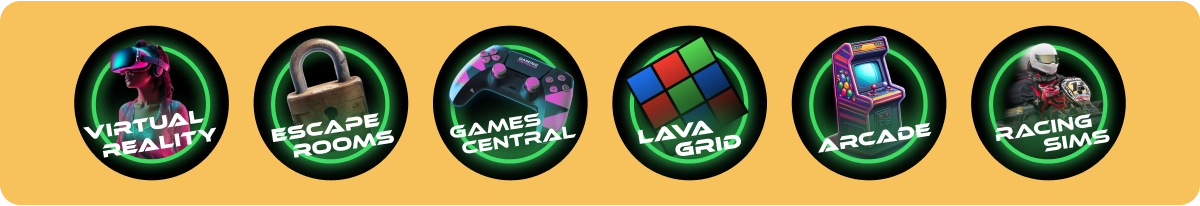
To help communicate that The Matrix Arena offers far more than just VR, I designed a full set of custom icons representing each key activity: Virtual Reality, Escape Rooms, Games Central, Lava Grid, Arcade, and Racing Sims. Each icon uses bold visuals and neon styling to reinforce the high-energy brand and give each offering a distinct identity.
These icons were applied consistently across web and print to improve scannability and help visitors quickly grasp what’s available. The icons also supported the new age-based categories and booking structure across the website.
I also designed a vertical banner, which was printed and displayed during the Isle of Man TT races to attract new customers. It featured a clear headline, activity breakdowns, and large, vibrant icons to catch the eye of passing foot traffic. The goal was to make the venue’s full value immediately obvious at a glance — even without reading any small print.
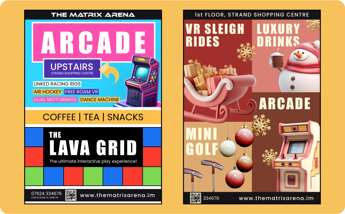
06. STREET-VISIBLE POSTERS
To capture the attention of passersby on the busy Strand Street and around the venue entrance, I created a series of bold, high-impact posters. While the rest of the brand leans heavily on black and neon tones, these physical pieces intentionally use brighter palettes and playful 3D illustrations to stop people in their tracks.
Each poster was designed for clear visibility at a distance, promoting seasonal offers like VR sleigh rides and mini golf, or permanent attractions like The Lava Grid and Arcade. The layouts balance accessibility with visual energy, using large typography, vibrant backgrounds, and a modular structure for quick scanning.
This work was part of a broader effort to support footfall and casual drop-ins—not just bookings—by making the offering feel approachable, dynamic, and fun.
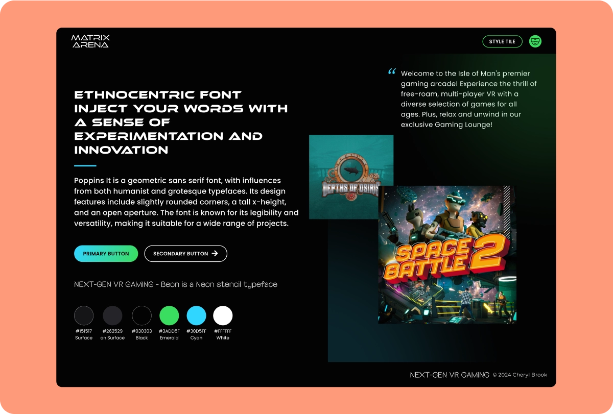
07. STYLE TILE & BRAND SYSTEM
To bring visual consistency across digital and print, I developed a style tile capturing the key elements of the Matrix Arena look. The brand uses a bold neon palette of greens, purples, and blues on dark backgrounds, with glowing gradients and subtle light effects to evoke sci-fi and gaming culture. Typography combines futuristic display fonts with clean sans-serifs to balance style with clarity. These decisions shaped everything from the website buttons to physical signage and event posters.
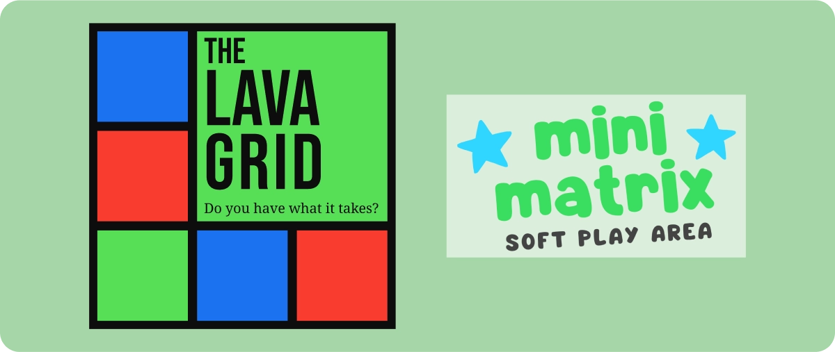
08. SUB-BRAND LOGOS
As part of the expansion of the venue’s offerings, I designed two new logos. The Lava Grid logo visually references the arena’s illuminated LED floor game, with a modular and energetic design. The Mini Matrix logo was developed for younger visitors, using a more playful visual language while staying true to the overall brand. Both logos were created to scale well across print and digital use, from stickers to mobile icons.
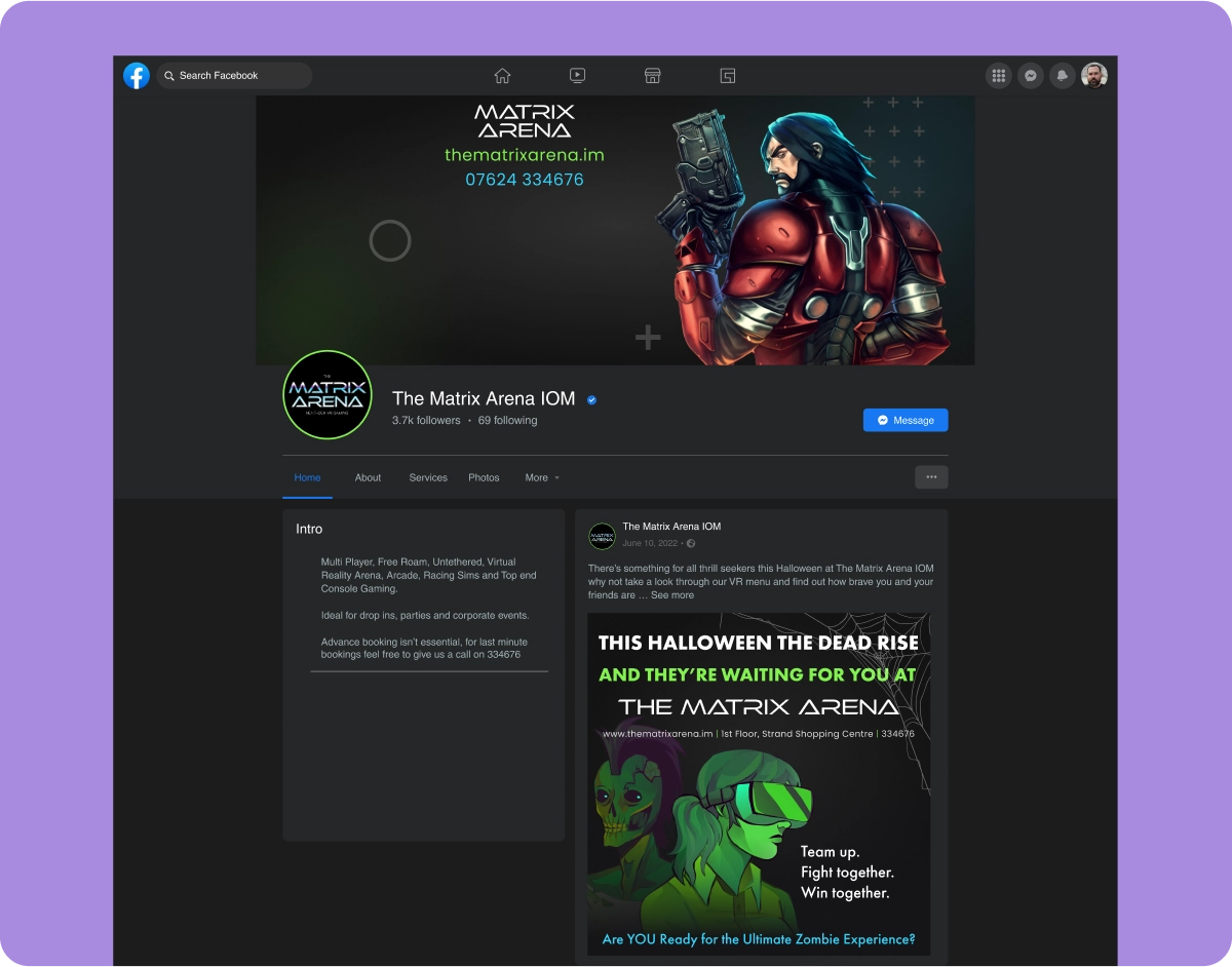
09. SOCIAL MEDIA ASSETS
To help drive awareness and engagement, I created a variety of promotional graphics for use across Instagram, Facebook, and other digital campaigns. These included seasonal graphics for Halloween and Christmas, special event announcements, and evergreen messaging for gift cards and group bookings. The visuals mix custom illustration with photography, ensuring they remain eye-catching and scroll-stopping.
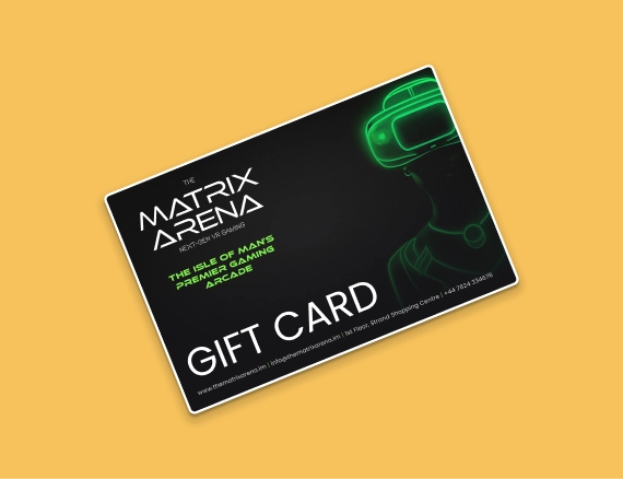
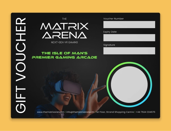
10. GIFT CARD & VOUCHER DESIGN
I designed a full set of branded gift cards and physical vouchers for in-store and online use. These used strong contrast, layered glows, and on-brand typography to stand out visually. The cards highlight the venue’s personality while also including all the key information needed for purchase, redemption, and contact.
05. RELECTIONS
This project pushed me to think beyond just screens and interfaces. I had to consider how the brand shows up across touchpoints, from large-format posters viewed in the street to small mobile buttons, from social media graphics to in-store signage. One of the most rewarding aspects was seeing how cohesive branding and thoughtful UX could directly reduce confusion, support staff, and drive more bookings — both online and in person.
I learned a lot about designing for both print and web at the same time, juggling production needs while staying visually consistent. The wide variety of deliverables meant working flexibly across tools and formats, but always staying grounded in the same visual system. It was also satisfying to work with real business goals in mind, helping a local entertainment venue thrive by making its value clearer and more accessible.