
Building a Scalable Design System in Figma
I created a fully documented design system in Figma with semantic tokens, responsive components, and clear specs, all built to align closely with developer workflows. By mapping tokens directly to CSS variables and supporting light and dark modes, the system reduced friction, improved consistency, and scaled easily across multiple products and teams.
01. STYLE LIBRARY
GETTING THE BASICS RIGHT - THE STYLE LIBRARY
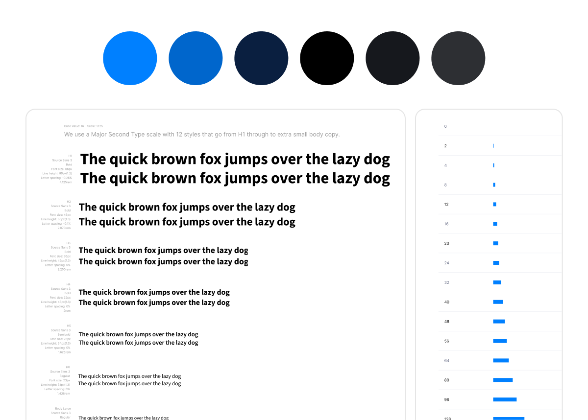
Before building components or variables, I defined the foundations. This included a complete style library of colours, typography, spacing, grids, and border radius, all mapped directly to CSS global styles. I worked closely with developers to ensure values aligned 1:1 across Figma and code, enabling a consistent, scalable base for tokens and theming to follow.
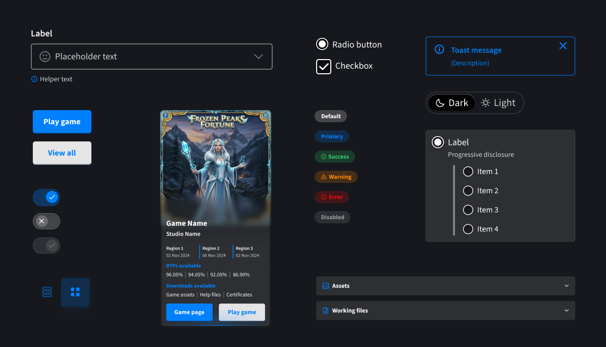
02. COLOUR VARIABLES &
SEMANTIC NAMING
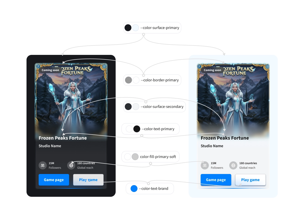
I established a clear semantic naming convention for colour tokens using a structured format that communicates class, element, value, and state. Every token supported both light and dark themes using transparency and WCAG AA-compliant contrast levels. When the team considered removing the light theme, I redesigned it using blue-tinted whites aligned with brand hues, transforming perception and saving it from deprecation. All tokens were reviewed with developers and mapped directly to global CSS variables to ensure implementation accuracy.
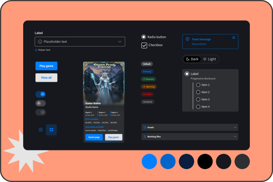
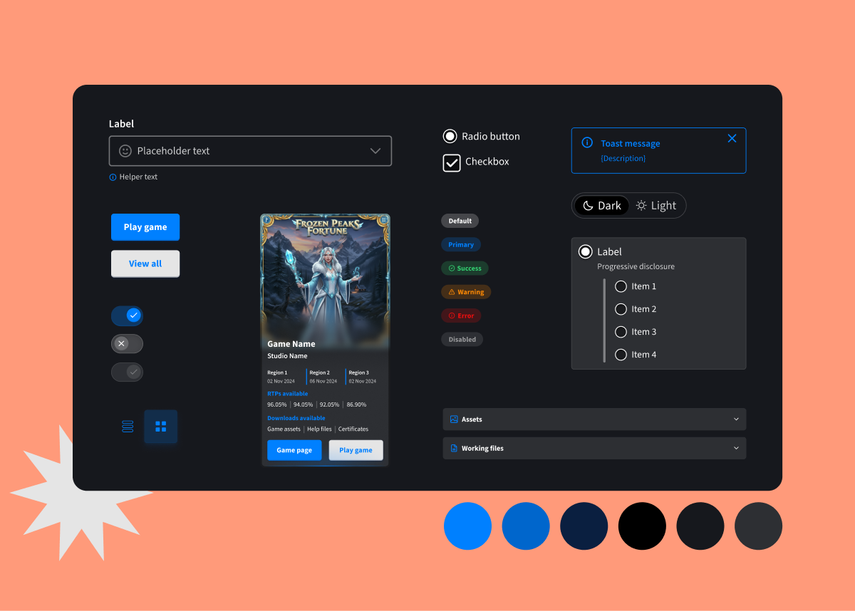
03. TOKENISED COMPONENTS
I built a robust component library using variables for things like breakpoints, interaction states, and theme toggles, along with booleans for toggling visibility, and instance swaps for icons, etc. Every element was built with token-driven properties for colors, spacing, and typography, ensuring components could be updated rapidly and across all instances in the product. This approach allowed us to scale efficiently while reducing QA cycles and implementation. I created fully dev-ready specs for each component type.
To evaluate the app’s usability and engagement, we ran two structured testing phases and a live in-company “Studio Quest” — an Easter-themed pilot that mimicked real event conditions.
In each phase, participants completed five key tasks while tracking completion rates and collecting both qualitative feedback and UMUX-Lite usability scores. The first round scored 80.01 (Good), which rose to 83.9 (Excellent) after design improvements.
Common issues like scan button discoverability and unclear tap targets led to changes in navigation, labels, and layout. Post-launch feedback from the Monaco event also highlighted feature ideas such as session notifications, contact access, adding tournaments to the app, and prize transparency, which are informed next-phase iterations.