
Tournaments Product Redesign
This full redesign moved Tournaments out of the client facing platform and into a standalone product with cinematic UI, mobile-first structure, and an integrated admin system. The MVP included custom lobbies, interactive leaderboard HUD, and scalable components to support future expansion.
01. OVERVIEW
PROJECT OVERVIEW
This project aimed to fully rebuild the tournament product, addressing both the player-facing front end and the internal tournament management functionality. A new cinematic UI was introduced to elevate the user experience and bring visual impact to the standalone platform.
Front end
The front end will be decoupled from the client facing platform and launched as a standalone domain to support greater scalability, flexibility, and performance as the product evolves.
Back office
On the admin side, the existing tournament setup tools will be migrated to the new Back Office platform. This move supports platform consolidation and enables a more streamlined, maintainable experience for internal teams managing campaigns.
THE PROBLEM
The current Tournaments section in the client facing platform presents significant usability and functionality challenges for both external users and internal teams.
The front-end experience is visually outdated and lacks intuitive navigation, limiting engagement from users who access tournaments via banners, mailers, or direct links. The mobile interface, in particular, is the most critical pain point, visually outdated, poorly structured, and difficult to use during live events. As the business aims to run more tournaments at events and increase engagement, a mobile-first experience is essential.
Simultaneously, the back office for the admin tool used by the internal team is inefficient, making tournament creation and management time-consuming and error-prone.
These issues hinder both the player experience and operational efficiency, highlighting the need for a comprehensive redesign to modernise the interface, enhance usability, and streamline internal workflows.
02. GOALS

USER GOALS
Players needed an easy way to browse, join, and track tournaments. They wanted to quickly understand rules, view leaderboards, and access live results without breaking gameplay flow. The experience had to be visually engaging, intuitive, and responsive across devices.

BUSINESS GOALS
The goal was to move Tournaments out of the core platform into a scalable standalone product. It needed to boost player engagement, reduce admin setup time, and support customisation for partners. A polished UI and robust backend were critical to deliver consistent, event-ready performance.
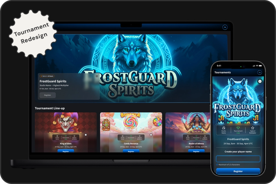
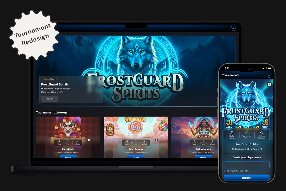
03. MOBILE PROTOTYPE
04. BASELINE USER TESTING
To evaluate the existing tournament UX, I ran usability testing with employees completing key flows across mobile and desktop. Results showed a UMUX-Lite score of 74.7 (Good), indicating a solid baseline but revealed major usability issues on mobile and room to improve.
Key pain points included poor leaderboard visibility, confusing game launch instructions, unclear scoring, and no easy access to rules. These insights shaped our priorities for the MVP redesign.
05. DESIGN & COLLABORATION
The first phase focused on mapping out user flows for both internal users and guest players, accounting for different account types, permissions, and access paths. From there, I designed a bold, cinematic UI that aligned with our design system and branding, while elevating the visual impact through richer interactions and polished visual detailing.
Key elements included the interactive leaderboard HUD, tournament cards, registration and gameplay screens, and scalable lobby layouts. This also included bespoke lobby designs for partners, offering flexible configurations while retaining visual consistency.
After finalising the mobile flow, I translated the experience to desktop, ensuring adaptability across screen sizes. All designs were reviewed in regular refinement sessions and discussed with product owners and developers to validate technical feasibility and alignment with business goals.


06. MVP USER TESTING
To evaluate the app’s usability and engagement, we ran two structured testing phases and a live in-company “Studio Quest” — an Easter-themed pilot that mimicked real event conditions.
In each phase, participants completed five key tasks while tracking completion rates and collecting both qualitative feedback and UMUX-Lite usability scores. The first round scored 80.01 (Good), which rose to 83.9 (Excellent) after design improvements.
Common issues like scan button discoverability and unclear tap targets led to changes in navigation, labels, and layout. Post-launch feedback from the Monaco event also highlighted feature ideas such as session notifications, contact access, adding tournaments to the app, and prize transparency, which are informed next-phase iterations.
07. BACK OFFICE ADMIN
The back office admin was designed using MUI components to streamline setup, improve visibility, and reduce friction across key workflows — from creating a lobby to managing tournaments and generating shareable access codes. The designs were clearly annotated with links to relevant MUI components, and closely aligned with the front-end product. Early collaboration and regular refinement sessions with developers ensured feasibility and smooth handoff

08. REFLECTIONS
Redesigning the Tournaments product was one of the most complex, end-to-end challenges I’ve worked on, spanning everything from usability research and component design to technical collaboration and admin workflows.
Working across both the cinematic front end and the MUI-based back office gave me a deeper understanding of how design decisions scale across platforms and teams. It also reinforced how important close collaboration with developers is, especially when balancing creativity with feasibility.
This project gave me the space to think holistically, push for better usability on mobile, and design for real-world workflows — not just screens. I left with stronger systems thinking, sharper research practice, and a whole new appreciation for what it takes to launch a truly scalable product.