

Finviz: Redesigning the Financial Stock Screener
Helping users reach success faster by simplifying filters, improving data clarity, and guiding upgrades with confidence
01. OVERVIEW
PROJECT OVERVIEW
This project focused on redesigning the early experience of Finviz, one of the most widely used stock screeners for investors and traders.
Finviz offers real-time data across stocks, crypto, and ETFs, but its interface is dense, complex, and difficult to learn. The goal of the redesign was to create a clearer, more supportive experience that helps users make confident decisions faster, while also encouraging upgrades to the Elite tier.
From a business perspective, the challenge was to reduce the average upgrade time from Free to Elite — from 42 days to 21 — without being disruptive or salesy. Instead, the redesign focuses on surfacing value earlier, supporting exploration, and reducing cognitive overload.
THE PROBLEM
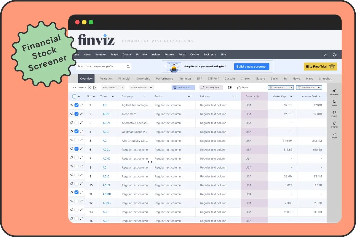
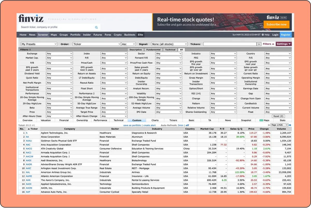
Finviz is undeniably powerful, but its interface makes it difficult for new users to access that power with confidence. The filters are scattered and unintuitive, leaving many unsure of where to begin. The data tables feel dense and overwhelming, with limited flexibility for users to tailor them to their needs. Key features like comparisons, alerts, and insights are buried in the interface and often go unnoticed. Without guidance, users frequently turn to external resources just to understand the basics. Visual clarity is lacking, onboarding is nearly nonexistent, and the upgrade path to Elite is poorly communicated. The result is a first-time experience that feels frustrating and unsupported — and a product that fails to convert when it could be delivering clear value.
02. CURRENT UI
03. GOALS

USER GOALS
Users needed to feel more confident navigating the platform from the start. They wanted to understand and apply filters without second-guessing, interpret data without friction, and learn through direct interaction rather than relying on outside tutorials. Most importantly, they needed to see progress quickly and feel in control of the interface from their very first session.

BUSINESS GOALS
The business aimed to reduce the time it takes for users to upgrade to Elite by making the value of the platform more immediately clear. Improving retention was just as important — users needed to feel confident and supported early on. The redesign also focused on increasing the perceived value of Elite features, making them discoverable and appealing without being disruptive. Ultimately, the goal was to minimise drop-off caused by confusion, complexity, or overwhelm.
04. DESIGN KPIs
To measure the impact of the redesign, the focus was on a set of experience-driven metrics. These included the time it takes for users to make their first successful interaction, how quickly they return to the platform, and how long it takes to upgrade to Elite. Other key indicators included overall satisfaction, engagement with premium features, and a reduction in drop-off during the first session. Every decision, from onboarding to filters to data clarity, was made with these outcomes in mind.
05. THE SOLUTION
SMARTER FIRST EXPERIENCE
To help users feel confident sooner and to surface the value of the platform earlier, the redesign focused on three key areas: onboarding, filters, and the screener interface itself. These improvements work together to reduce overwhelm, highlight relevance, and support better decision-making from the start.
05. THE SOLUTION - PART 1
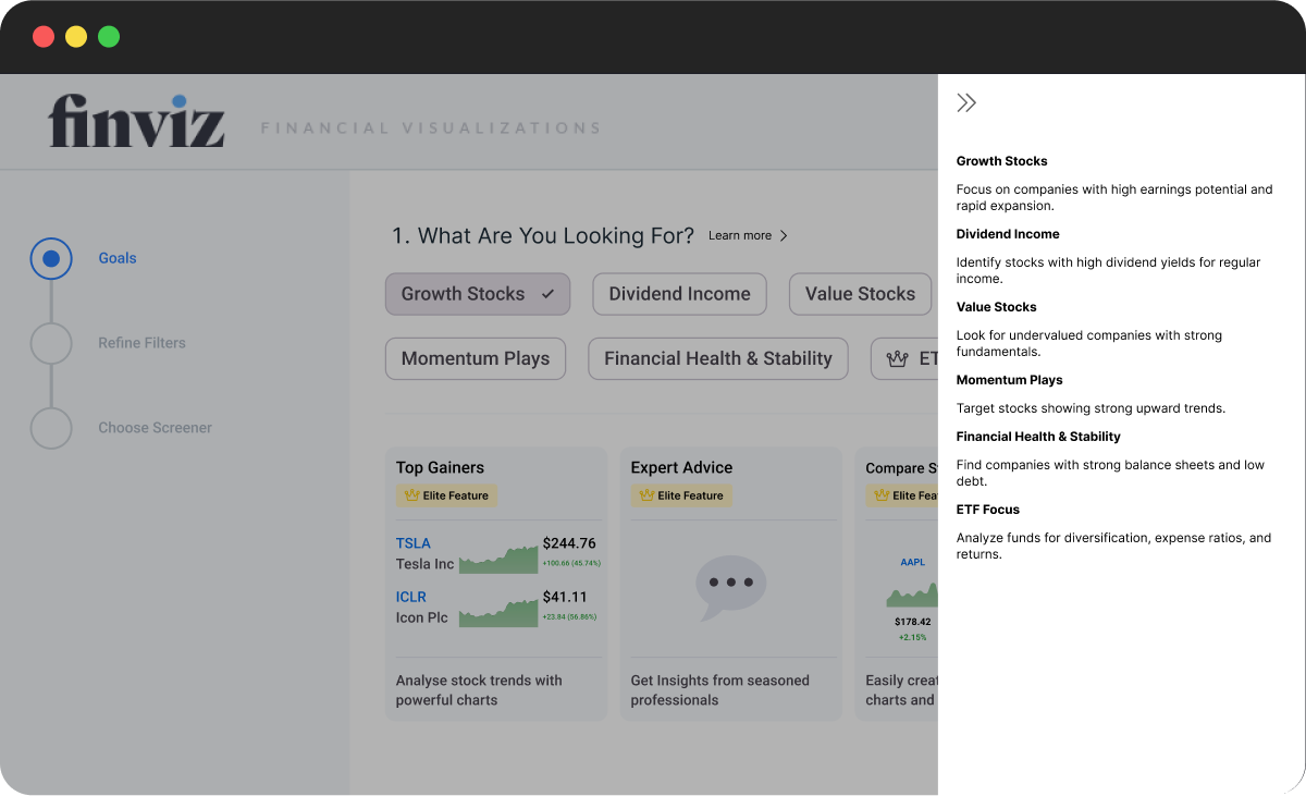
INTERACTIVE ONBOARDING WIZARD
Instead of dropping users straight into a dense, unfamiliar screener, the experience now begins with a lightweight onboarding flow. The wizard guides users through a series of simple steps: selecting an investment goal, applying curated filters, and previewing a screener tailored to their preferences. This creates a clear first success moment — users immediately see relevant data aligned with their intent. Along the way, Elite-exclusive features are highlighted subtly, reinforcing their value without pushing an upgrade too soon.
Onboarding: Goals & Contextual Sidebar
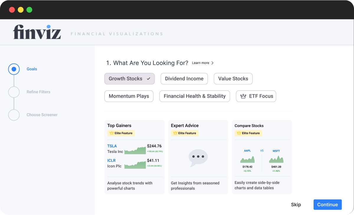
PROGRESS TRACKER
A simple progress tracker on the left helps orient users during onboarding without overwhelming them. Each step is clearly labeled and visually distinct, giving users a sense of where they are and what comes next — reducing friction and increasing task completion.
SIDEBAR
Clicking “Learn more” opens a contextual sidebar with clear explanations, avoiding the friction of hover-based tooltips.
ELITE FEATURE ICON
Elite Feature Icon shown next to the ETF Focus option
SNEAK PEEK CARDS
Elite Feature Sneak Peek Cards. The key idea here is to tease the value of Finviz early, even during onboarding, so users get a glimpse of the powerful data they’ll unlock, before they’ve done anything.
Onboarding: Refine Filters
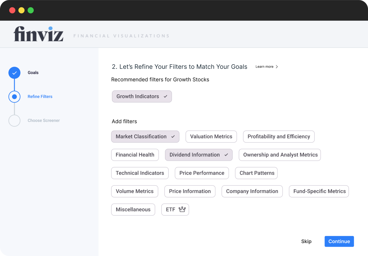
GROUPED FILTERS
Filters are grouped into meaningful categories, helping users understand how their selections relate to different investment goals. This makes it easier to scan, select, and build a screener with confidence.
DYNAMIC RECOMMENDATIONS
When users select more than one goal in Step 1, filters are dynamically combined and separated by group. This provides tailored suggestions without overwhelming the interface, even when strategies overlap.
IN-LINE DESELECTION
Clicking a selected filter moves it to the “Add more filters” section, making it easy to adjust preferences without losing visibility. This keeps the interaction light and forgiving.
LEARN BY DOING
Users don’t need to understand every metric upfront. Each filter can be selected, explored, and adjusted in real time — with helpful explanations available through the sidebar. This creates a low-risk, self-guided space to experiment, encouraging learning through interaction rather than instruction.
Onboarding: Select a Screener
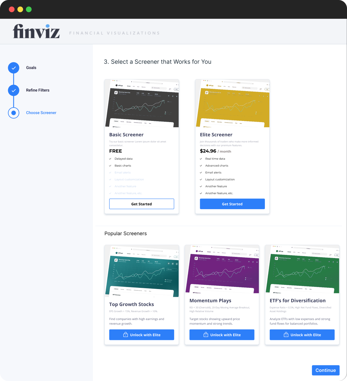
SCREENER OPTIONS
Presenting both the Basic and Elite screeners at the end of onboarding gives users a clear, low-pressure choice. Instead of hiding Elite behind a paywall, it’s surfaced alongside the Free option, emphasizing transparency and encouraging upgrades through informed value comparison.
POPULAR SCREENERS
Pre-built Elite screeners (like “Top Growth Stocks”) help users immediately see what’s possible. This also reinforces the idea of “learning by doing” — users can dive in and explore high-quality filters without needing to build from scratch.
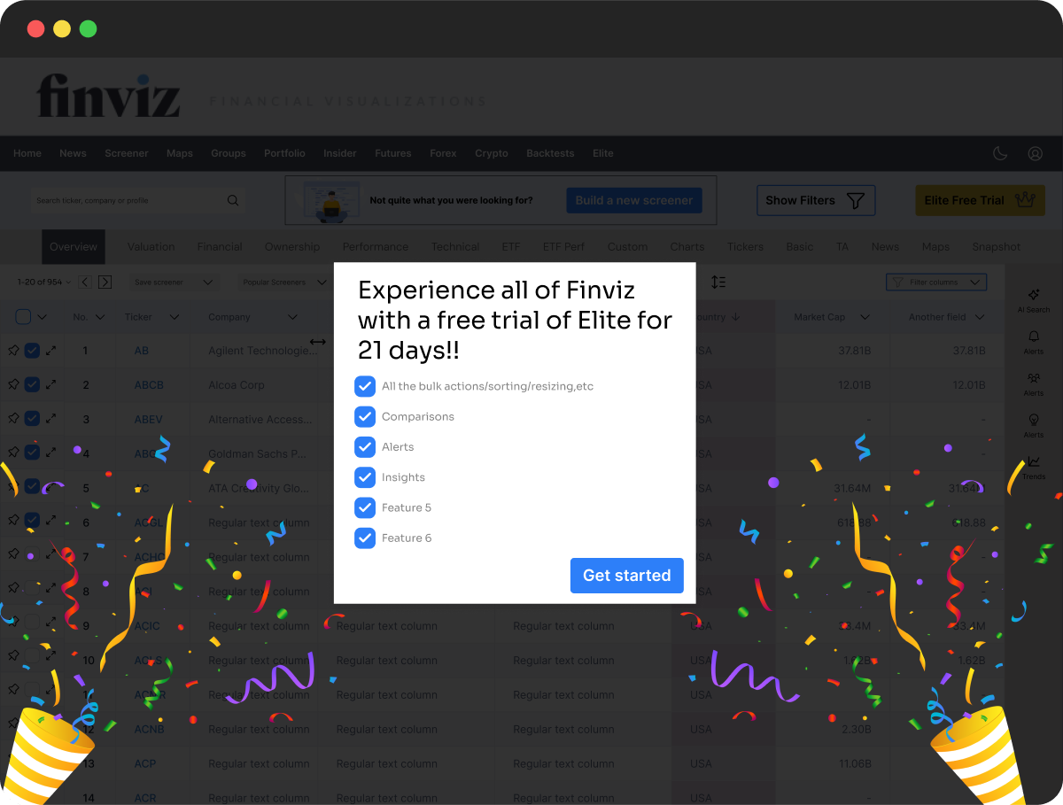
FREE TRIAL MOMENT
Selecting the Basic Screener activates a celebratory trial moment. This creates positive momentum and subtly rewards users for exploring, while encouraging them to try Elite features in a playful, low-risk way.
06. THE SOLUTION - PART 2
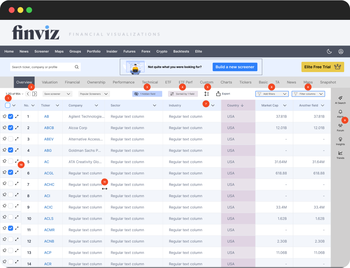
Key Interactions with the Screener Interface
1
BULK ROW ACTIONS
Quick tools to compare, alert, export, and manage selected rows.

Pin to top

Create alert

Sync to portfolio

Compare (side by side charts/tables)

Export

Share

Hide row

Delete row
2
PAGINATION
Easily browse large datasets with simple navigation controls.
Rows:
20
50
100
3
HIDDEN FIELDS
Access key tools like alerts, forum, insights, and trend analysis — all in one handy panel.
Find a field


No.
Ticker
Company
Sector
Industry
Country
Market Cap
Hide all
Show all
4
SORT
Sort by one or more columns to organize key data.
Sort by
Country

A to Z


Add another sort
5
TABLE DENSITY
Adjust row spacing to suit your screen or preference.
Select a row height

Compact

Standard

Comfortable
6
FILTER COLUMNS
Apply advanced filters using clear logic controls.
In this view, show records
Where
Country

contains

Enter a value

and

Market Cap

>

Enter a value


Add condition
7
COLUMN DROPDOWN
Sort, reorder, or remove fields directly from any column.
Search


Move right

Move left

Sort A to Z

Sort Z to A
Hide field
Delete field
8
ADD FILTERS
Suggested filters based on your screener goal for faster setup.
Add Filters
Growth Indicators

Market Classification
Valuation Metrics
Profitability and Efficiency
Financial Health
Dividend Information
Technical Indicators
Price Performance
Chart Patterns
9
ALERTS & MORE
Access key tools like alerts, forum, insights, and trend analysis — all in one handy panel.

AI Search

Alerts

Forum

Insights

Trends
10
EXPAND DETAILS
Quickly view in-depth stock charts and stats. no need to switch context.
11
RESIZABLE COLUMNS
Adjust column widths to focus on what matters most — streamline the view without losing context.
07. RELECTIONS
This project was part of the Smart Interface Design Patterns course and challenged me to rethink how onboarding, guidance, and conversion work together in complex, data-heavy environments. It showed me how even a product that feels overwhelming at first can become intuitive and rewarding, if you meet users where they are.
If I had more time, I’d explore adding alert icons directly to each row in the screener table, giving users quick access to a high-value feature without hunting for it. I’d also consider pre-loading a few relevant filters based on the user's chosen goal, to give the table more immediate context and reduce the sense of starting from scratch. I would also refine the UI further, improving font sizes, spacing, and alignment for better visual hierarchy and accessibility.


