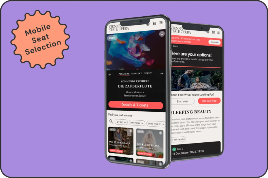

Vienna Opera House: Mobile Seat Selection Redesign
Improving the mobile booking experience for one of the world’s most iconic venues, with smarter interactions, clearer seat logic, and accessibility at the core.

VIEW PROTOTYPE IN FIGMA

01. OVERVIEW
PROJECT OVERVIEW
As part of the Smart Interface Design Patterns course, I redesigned the mobile seat selection experience for the Vienna Opera House.
Users were frustrated by unclear seat quality, confusing pricing, and limited accessibility options.
The goal: improve satisfaction and booking clarity, without adding any new features.
THE PROBLEM
The existing mobile booking flow doesn’t support how users want to explore or choose. It’s hard to assess seat quality, navigate the map, compare prices, or find accessible areas, especially on small screens. The map lacks clarity, and expectations of acoustics, seat views and distance, often don’t match reality.
Some users prefer to start with a specific performance. Others want to explore by seat type or budget first, but the current system forces a one-size-fits-all path that serves neither well.
02. ORIGINAL JOURNEY
The original seat selection journey
No True Filtering System in Seat Selection
“Best Seat” Logic Feels Arbitrary
No Clear Pathway or Prompt to the Annual Card
03. GOALS

USER GOALS
Users needed a smoother, more intuitive booking experience. They wanted to confidently compare seat quality and pricing, navigate the seat map with ease on mobile, and quickly identify accessible seating. Some preferred starting with a specific performance, while others looked for seats and pricing first, the system needed to support both paths.

BUSINESS GOALS
The Vienna Opera House aimed to improve customer satisfaction, reduce support queries, and encourage repeat bookings.
A key objective was to increase annual card sign-ups, while preserving the brand’s sense of cultural prestige and providing a seamless, polished mobile experience.

CONSTRAINTS
This project came with clear limitations: no new features could be introduced, and all existing filters and functionality had to remain.
The design had to be mobile-first, and the annual card offering needed to be subtly promoted within the interface, without disrupting the existing flow.
04. RESEARCH TAKEAWAYS
Best practices from similar venues
Cirque du Soleil
Map & List Views
The Met Opera
Clear seating levels
The O2 Arena
Normalised/Interactive seat map
05. DESIGN KPIs
The redesign aimed to improve key experience metrics including time to first purchase, repeat booking behavior, annual card conversion, overall satisfaction, and abandonment rates.
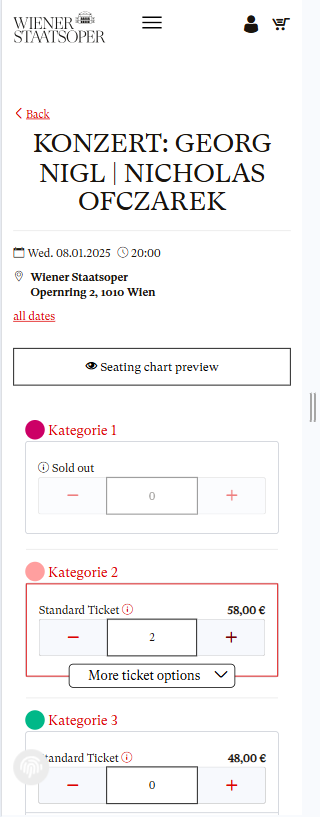
06. THE SOLUTION - PART 1
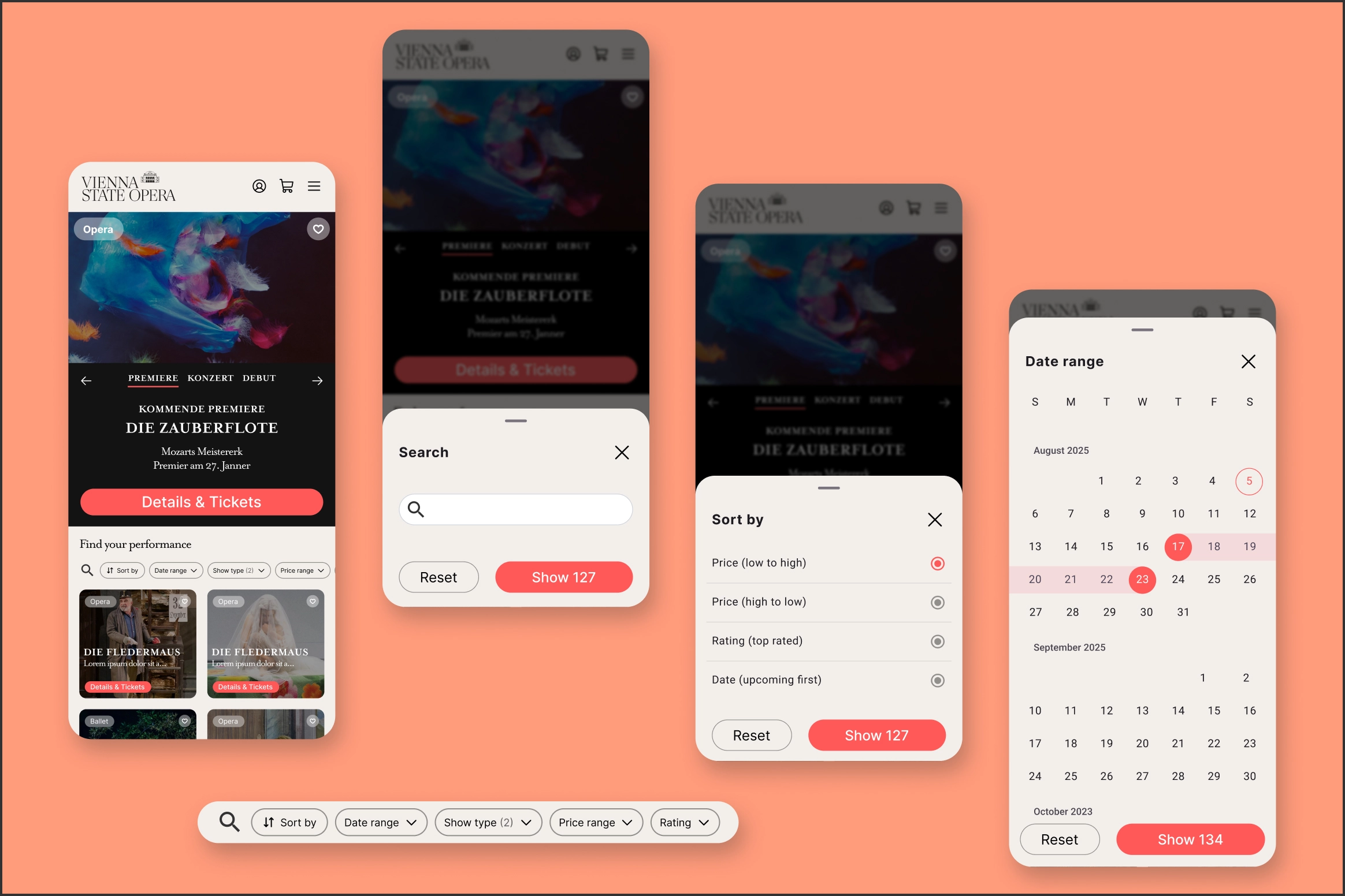
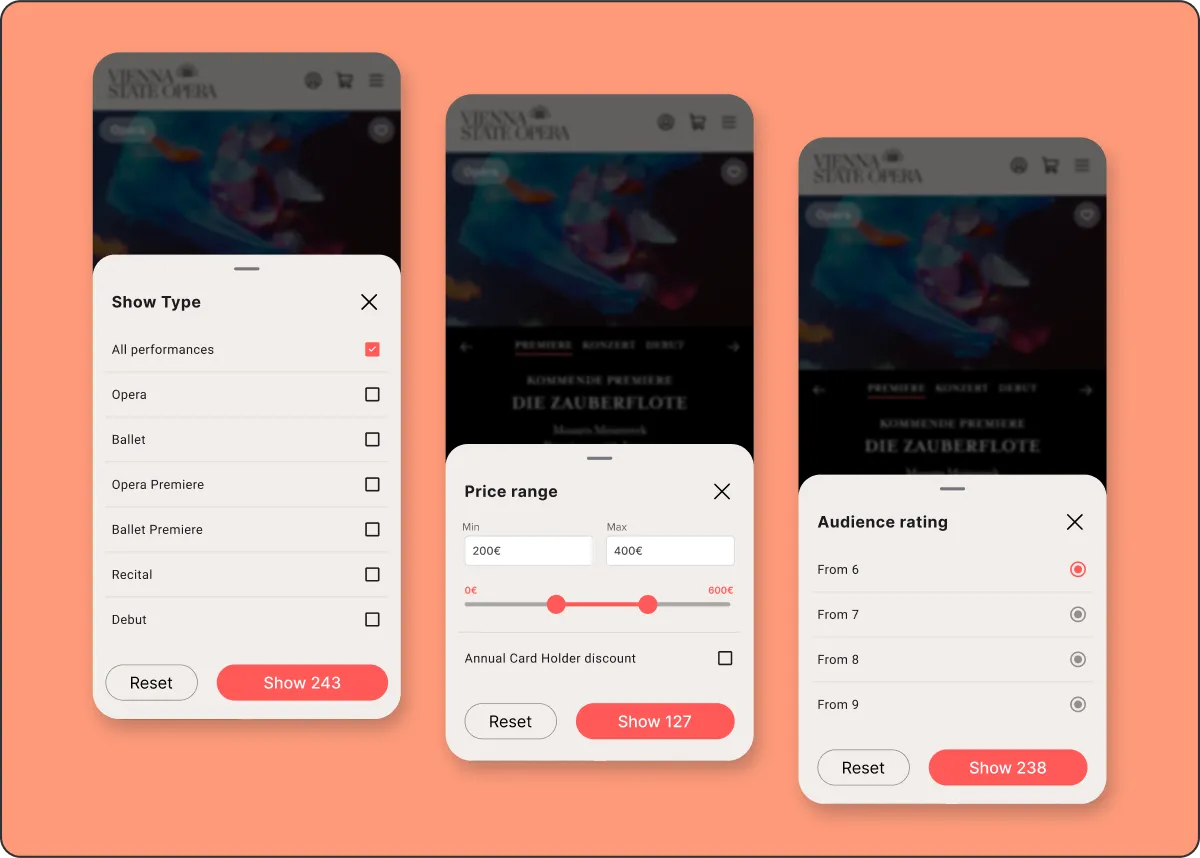
PERFORMANCE LISTING PAGE
The original system included some filters, but they were limited and hidden in dropdowns. The new listing page brings filtering to the forefront, making it easier to browse performances by date, price, show type, or audience rating. Real-time result counts update as users apply filters, helping them quickly find what matches their needs, whether that’s a weekend ballet or the best-rated show under €300.
06. THE SOLUTION - PART 2
AFTER PERFORMANCE SELECTION
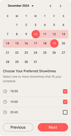
Once a user selects a performance, the new experience offers two clear, flexible ways to choose a seat. They can either browse the interactive seat map using filters for preferences like accessibility and aisle seats, or take a more guided approach using the “Help Me Find a Seat” wizard, which recommends seats based on their specific needs.
This dual-path system gives users more control and confidence, whether they want to explore manually or be guided to the best option. Visual seat previews, detailed filters, and real-time availability make the process feel intuitive and informed.
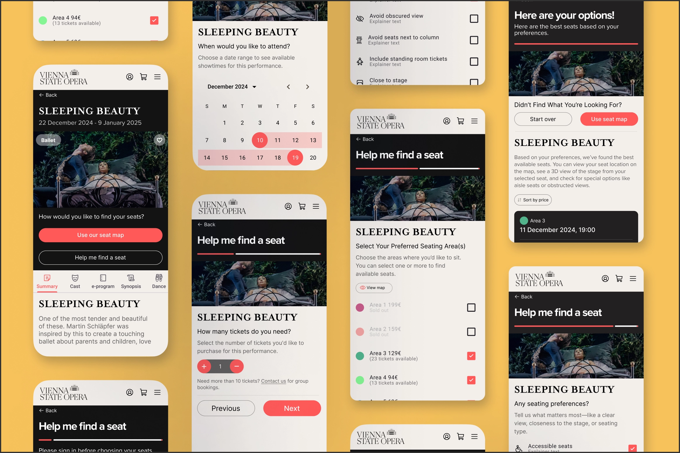
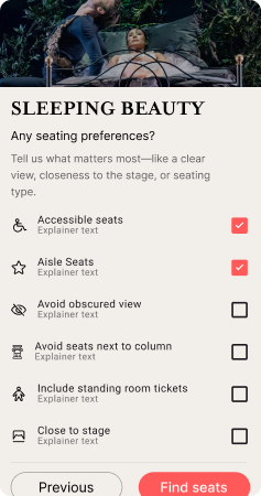
“Help Me Find a Seat” Wizard
Progressive Disclosure
Important conditions and restrictions are surfaced only when relevant — keeping the flow clean and focused without hiding critical info.
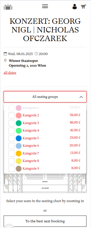
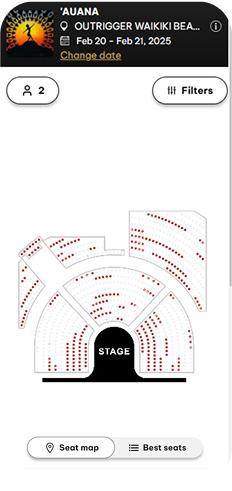
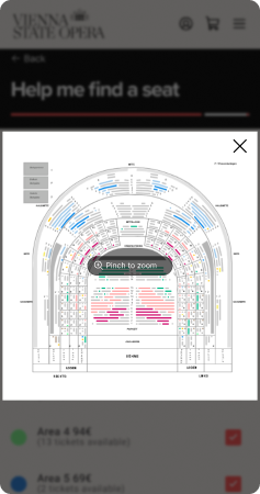
Seating Area Preview with Visual Map
The seating areas are color-coded and accompanied by a preview map, helping users make confident trade-offs between price and location.
Final Personalisation Step
This step feels genuinely tailored. Users can express things like “I want aisle seats,” “Avoid column view,” or “Close to stage” — a level of control the original experience completely lacked.
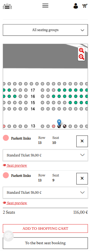
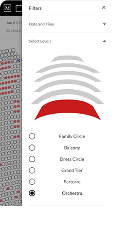
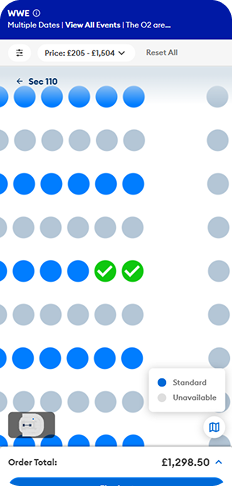
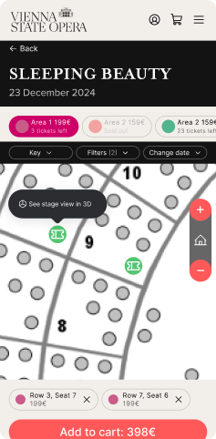
Interactive Seat Map
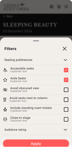
Smart Filters Directly on the Map
Filters like accessibility, view quality, and proximity are built into the seat map, giving users the power to personalise their booking experience on the fly.
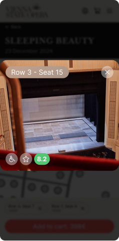
Real Seat Previews with Photo + Rating
A photo-based seat preview with ratings shows exactly what to expect — reducing surprises and improving seat satisfaction.
Map Zoom That Doesn’t Get in the Way
The seat map allows intuitive zoom and exploration while keeping all key actions — like changing filters or dates — within reach.
06. THE SOLUTION - PART 3
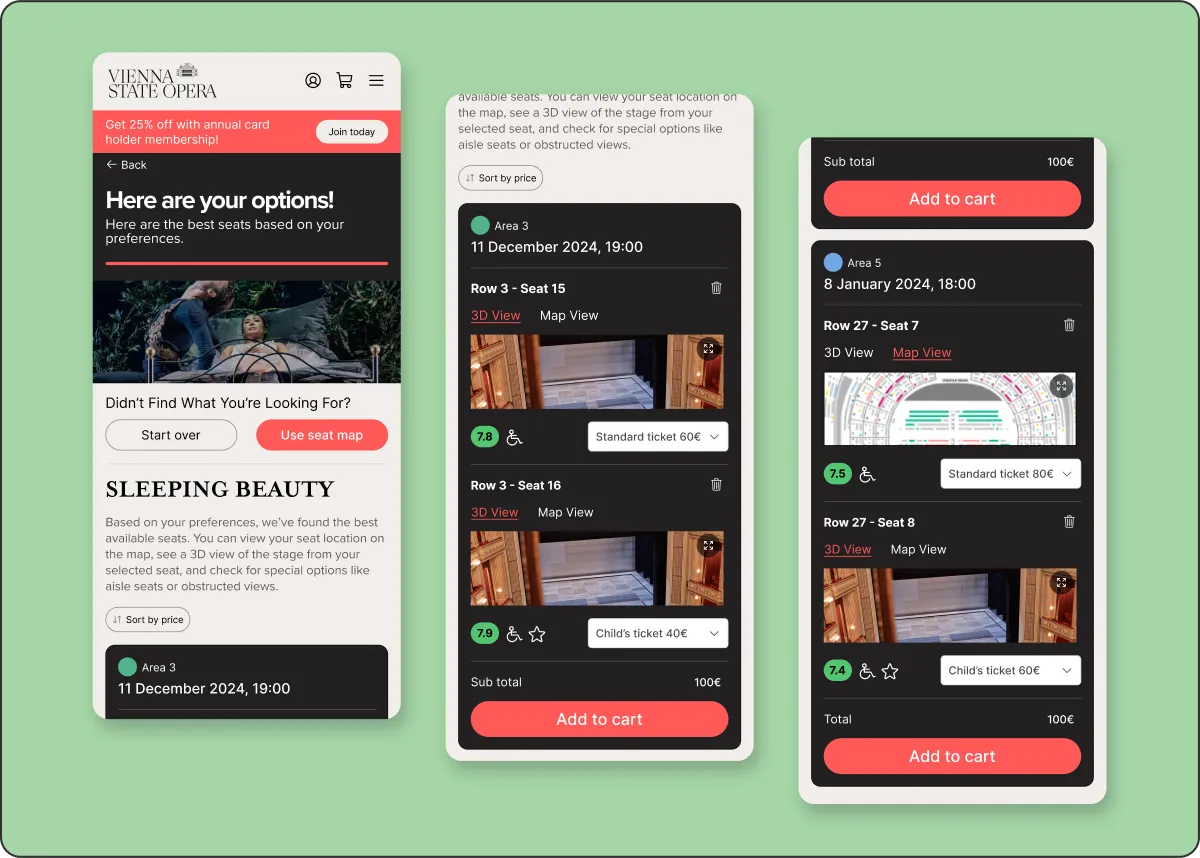
FINAL SEAT SELECTION
The redesigned summary screen presents users with a clear, personalised list of seat options based on their preferences. They can sort results by price, preview seats in 3D or on the map, and easily start over if they want to adjust their choices. Each seat is shown with full context: price, audience rating, and a seat image. Annual card discounts are clearly highlighted where relevant.
It’s a high-confidence moment that brings together transparency, flexibility, and a gentle nudge toward membership.