


Digital Hygiene Quiz Website - Designed and Coded
A responsive landing page designed to promote online privacy awareness through a fun, fast mini quiz and instant results.
VIEW SITE

01. OVERVIEW
PROJECT OVERVIEW
Commissioned by Dr. Robert Epstein, this project aimed to create a bite-sized digital hygiene test that encourages users to explore a more comprehensive 110-item version. The challenge was to make the subject of online privacy feel fun, clear, and approachable, without losing credibility.
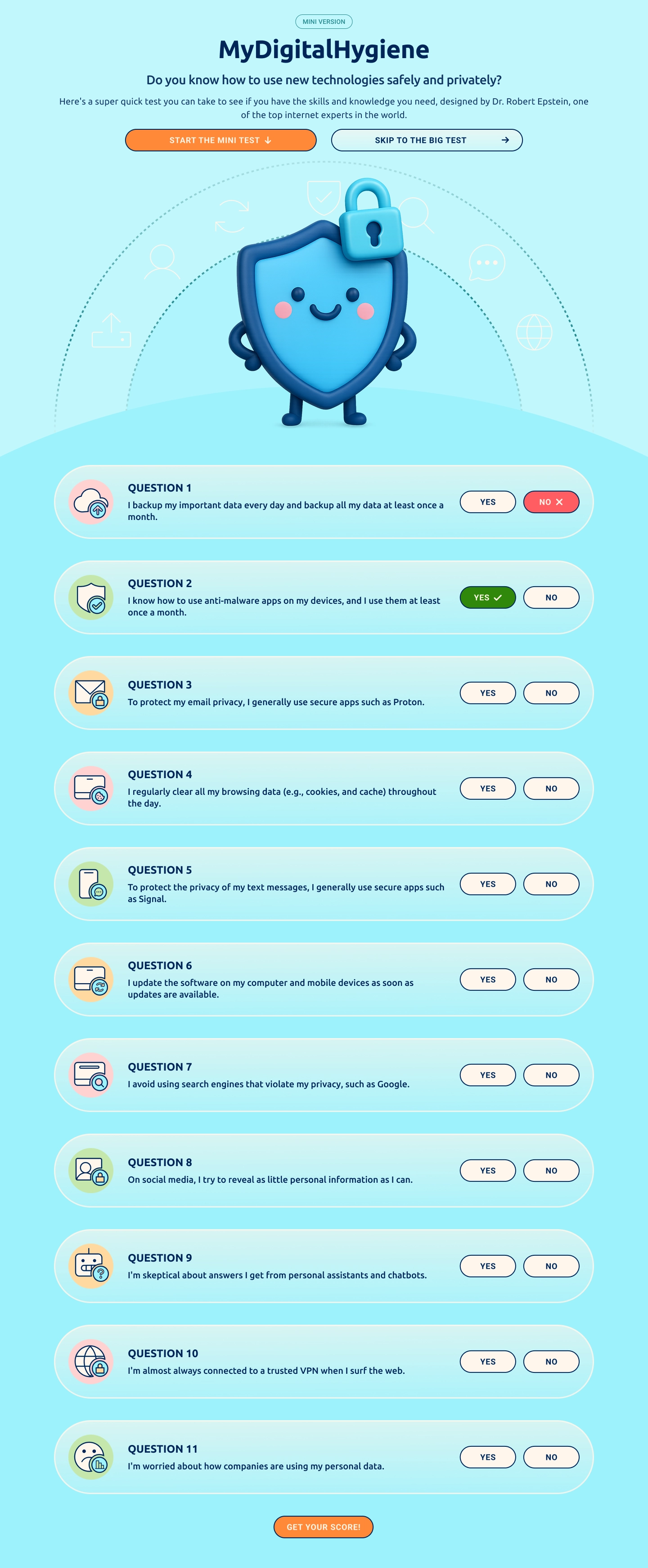
I designed the entire interface system — including icon set, color palette, typography, hero image, and responsive components and delivered a fully functional front-end built in HTML and CSS. The experience includes a 10-question quiz, 3 results modals, and CTA to the full test.
03. GOALS

USER GOALS
Users needed a quick and engaging way to assess their online privacy habits without feeling overwhelmed. The experience had to feel approachable, visually clear, and responsive on any device, guiding users naturally toward taking the full version of the test.

BUSINESS GOALS
For the client, the goal was to increase awareness of digital hygiene while driving traffic to the full 110-question assessment. The project needed to balance playful design with credibility and deliver a fast-loading, shareable experience that encouraged deeper engagement.
03. DESIGN FOCUS
The design aimed to create a smooth, low-friction experience that users could complete quickly and enjoyably. Key priorities included clarity, responsiveness across devices, and a friendly visual tone that built trust without feeling overly serious. The interface was designed to encourage quiz completion and gently guide users toward taking the full test.
04. THE SOLUTION
VISUAL LANGUAGE
I created a complete visual system for the site, including a full set of custom icons, a friendly but clean sans-serif typeface, and a soft, accessible colour palette. The goal was to make the topic feel approachable while still credible. The hero illustration and UI elements were designed to feel light, modern, and visually cohesive.
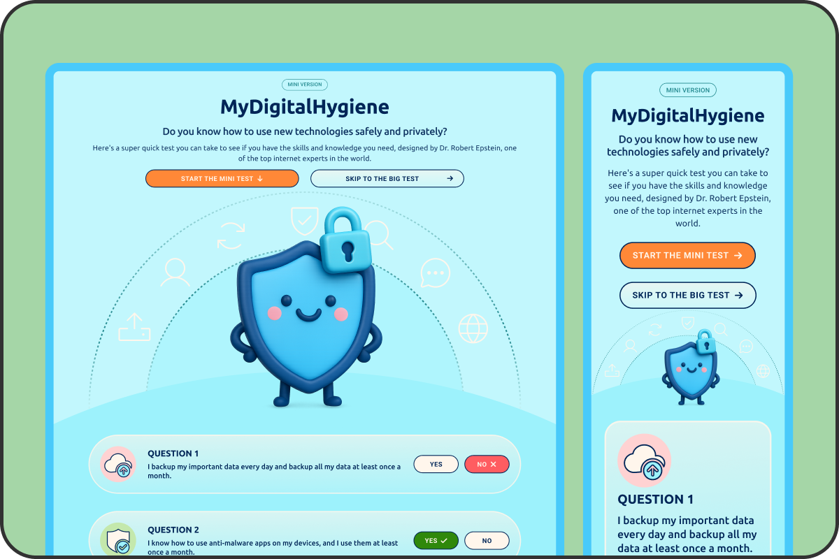
COMPONENTS AND INTERACTIONS
All interface elements were built as reusable components, including buttons, modals, and question cards. Buttons include hover and active states, and components were styled to work consistently across breakpoints. I designed all layout behaviour and component logic for both mobile and desktop views.
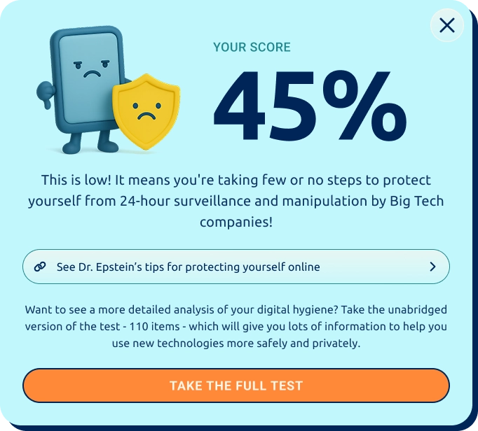
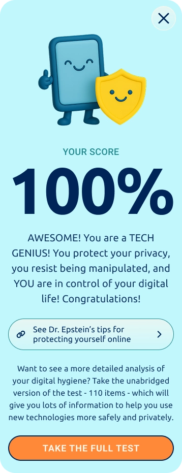
Results Modals
RESPONSIVE DESIGN
Both mobile and desktop versions were designed in parallel to ensure consistency and usability across devices. Layouts shift fluidly with clear hierarchy, tap-friendly spacing, and no loss of functionality or clarity between screen sizes.
Desktop & Mobile Designs

FRONT-END BUILD
After designing the layout in Figma, I used Anima to export the initial front-end code, then manually refined the HTML and CSS to improve structure, styling, and responsiveness. Once complete, I delivered the HTML, CSS, and image assets as a fully responsive front-end handoff, ready to be integrated with the back end using PHP.
05. RELECTIONS
This project was a chance to step outside my usual design role and take full ownership of a live experience, from concept to code. I don't come from a development background, but I challenged myself to bring the UI to life using tools like Anima and AI-assisted coding to help refine the HTML and CSS.
Figuring out how to make the layout responsive and hand it off cleanly was a steep but satisfying learning curve, and it gave me a much stronger understanding of how design decisions translate into real, usable code. More importantly, it gave me confidence in working across the full product workflow, from visual design to developer-ready assets.
It reminded me that shipping something polished and functional is possible with curiosity, commitment, and the right support tools — and that designers can (and should) stretch into new territory.